Work / B2B E-commerce / SaaS Redesign
Clove
Clove is a B2B e-commerce workflow that puts sales data, stock, PO management, and customer engagement at the user’s fingertips. Its Advertising Manager and Inventory tools had grown cluttered and hard to navigate, I redesigned them around how sellers actually decide.
Too much dashboard, too little decision
Amazon sellers operate in a highly complex, fast-paced environment where managing inventory, sales, and analytics simultaneously is necessary for survival. Despite the availability of data, sellers were overwhelmed, relying on infinitely scrolling, disconnected data tables that caused extreme cognitive overload and decision fatigue.
Clove’s original interface for the Advertising Manager and Inventory Management tools was cluttered, difficult to navigate, and lacked intuitive elements to guide users through critical tasks such as creating ad campaigns or updating stock levels. User complaints clustered in three areas:
- Difficulties finding key features: the tools were there; the paths to them weren’t.
- Confusion around data representation: charts didn’t answer the questions sellers actually had.
- Lack of real-time insights: decisions were being made on stale information.
The goal: redesign the interface into a user-friendly, intuitive experience that supports quick decision-making, while keeping the design scalable for future features.
Contextual inquiry, before pixels
I employed contextual inquiry as the pivotal research method in early discovery, observing and interviewing a select group of users in the context of their real work, which surfaces insights that directly inform requirements, personas, and content strategy. On top of that sat extensive interviews and usability-testing sessions with current Clove users, asking questions like:
- “What tasks do you find most challenging in the current interface?”
- “Can you walk me through how you create a new ad campaign?”
- “What improvements would make managing your inventory easier?”
Three findings carried the redesign: overwhelming dashboards that displayed too much at once and made prioritizing hard, complicated navigation that buried campaign and stock tools, and an inefficient workflow that forced users across multiple screens to finish a single task.
From sketch to screen
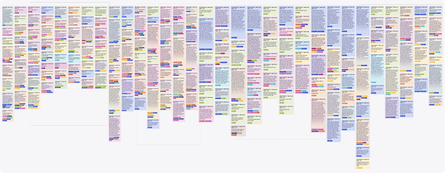
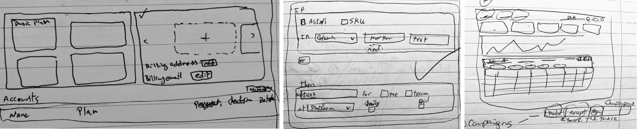
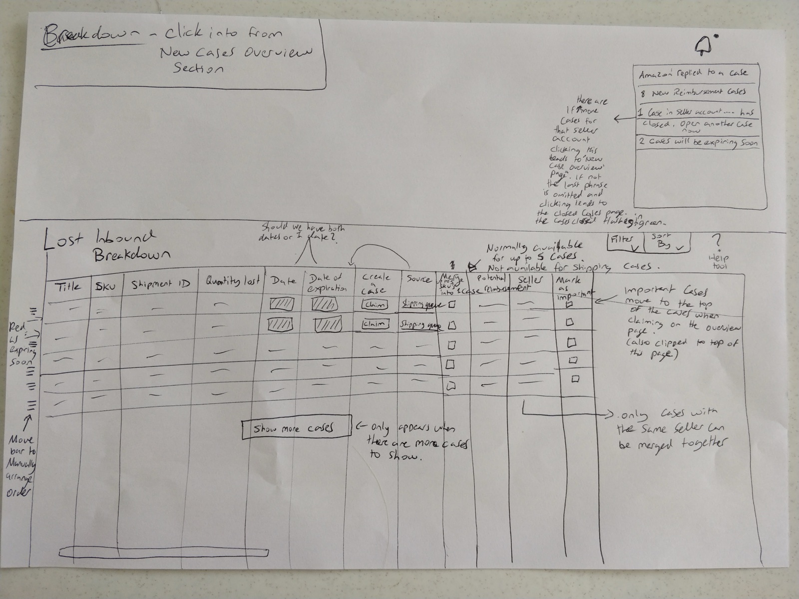
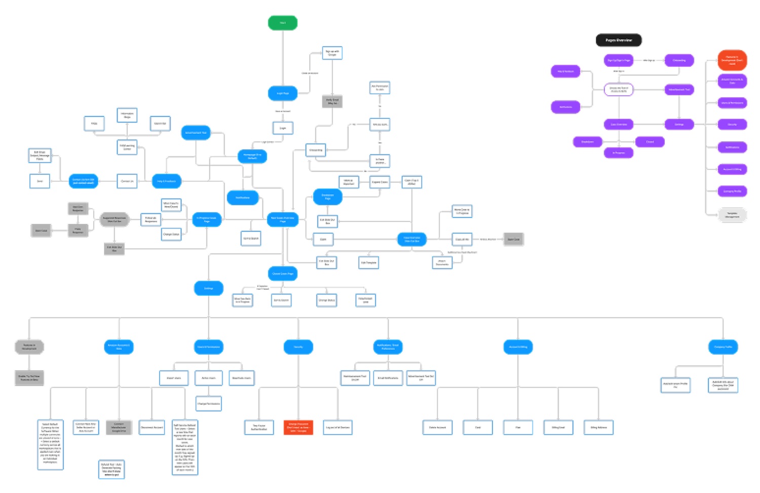
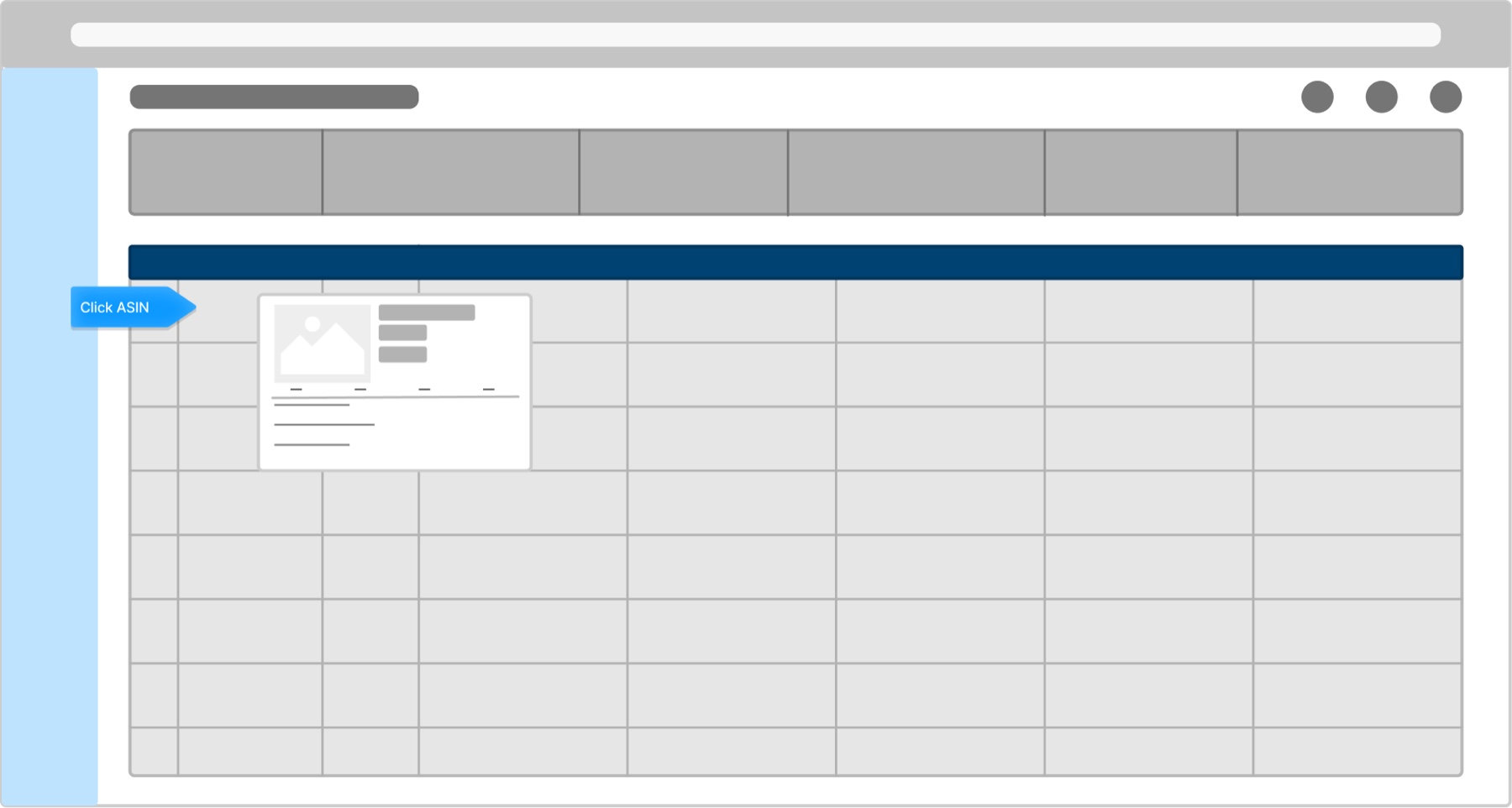
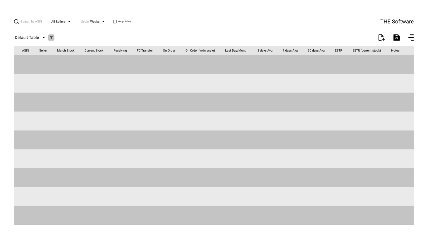
With the pain points named, the work moved in deliberate stages: rough sketches to test the riskiest ideas, an information architecture to settle navigation, low-fidelity wireframes to agree on structure, then high-fidelity screens populated with real data, and finally eye-tracking to check the result against behavior.
One view per decision
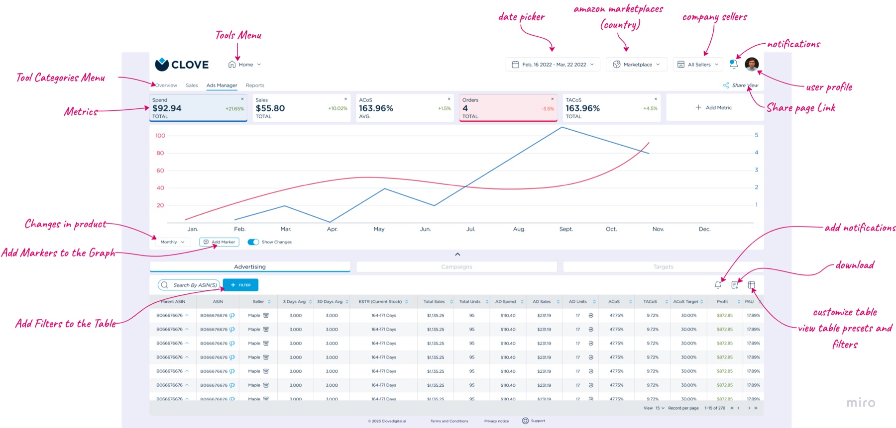
From sketches with clear hierarchy to mid-fidelity wireframes in Figma, populated with potential real-world data so tests measured comprehension, not lorem ipsum, the redesign streamlined the most common actions and cut cognitive load:
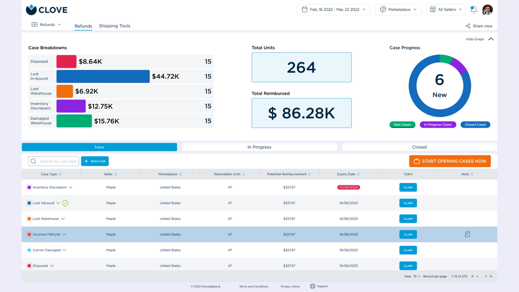
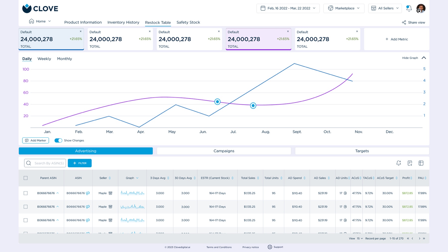
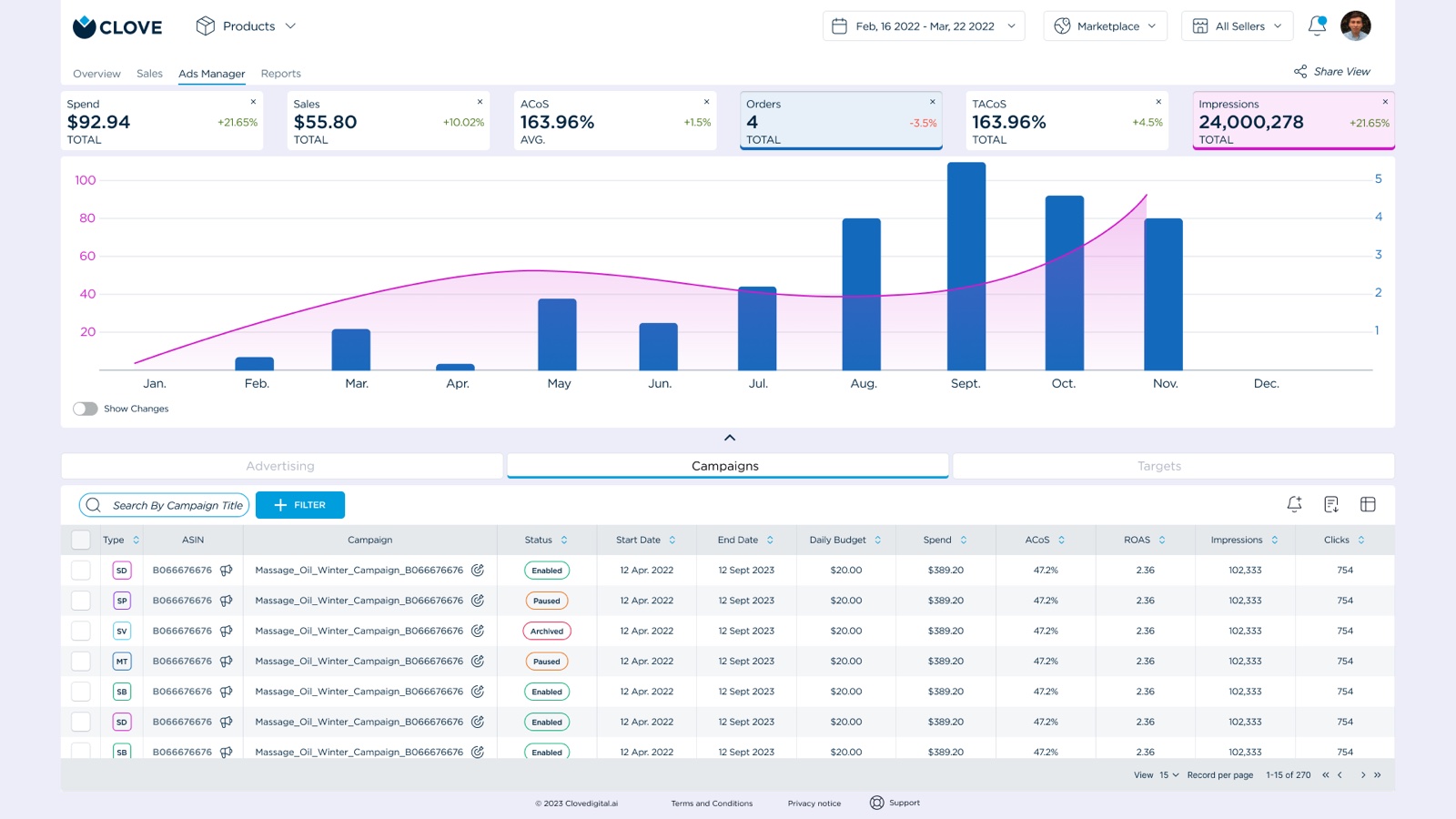
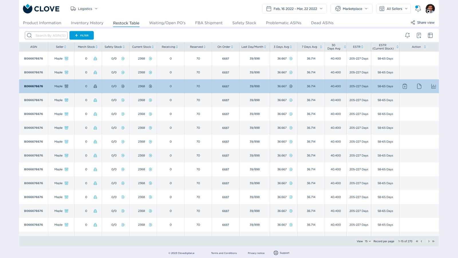
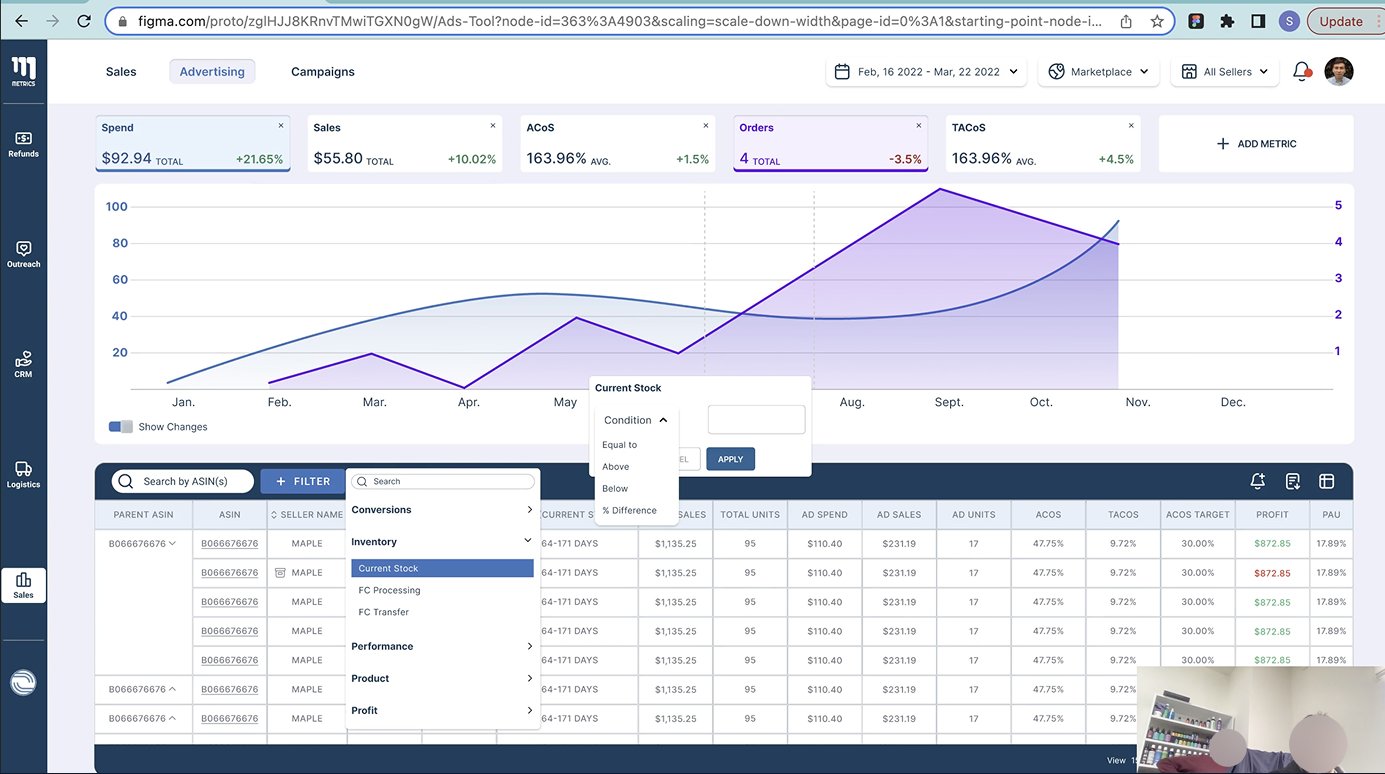
- Ad Manager: KPIs (spend, sales, ACoS) shown prominently with a clear color-coded system; charts gained hover interactions for granular insights.
- Inventory Management: stock levels and restocking alerts brought into a single view; action buttons like restock and update stock made unmistakably visible.

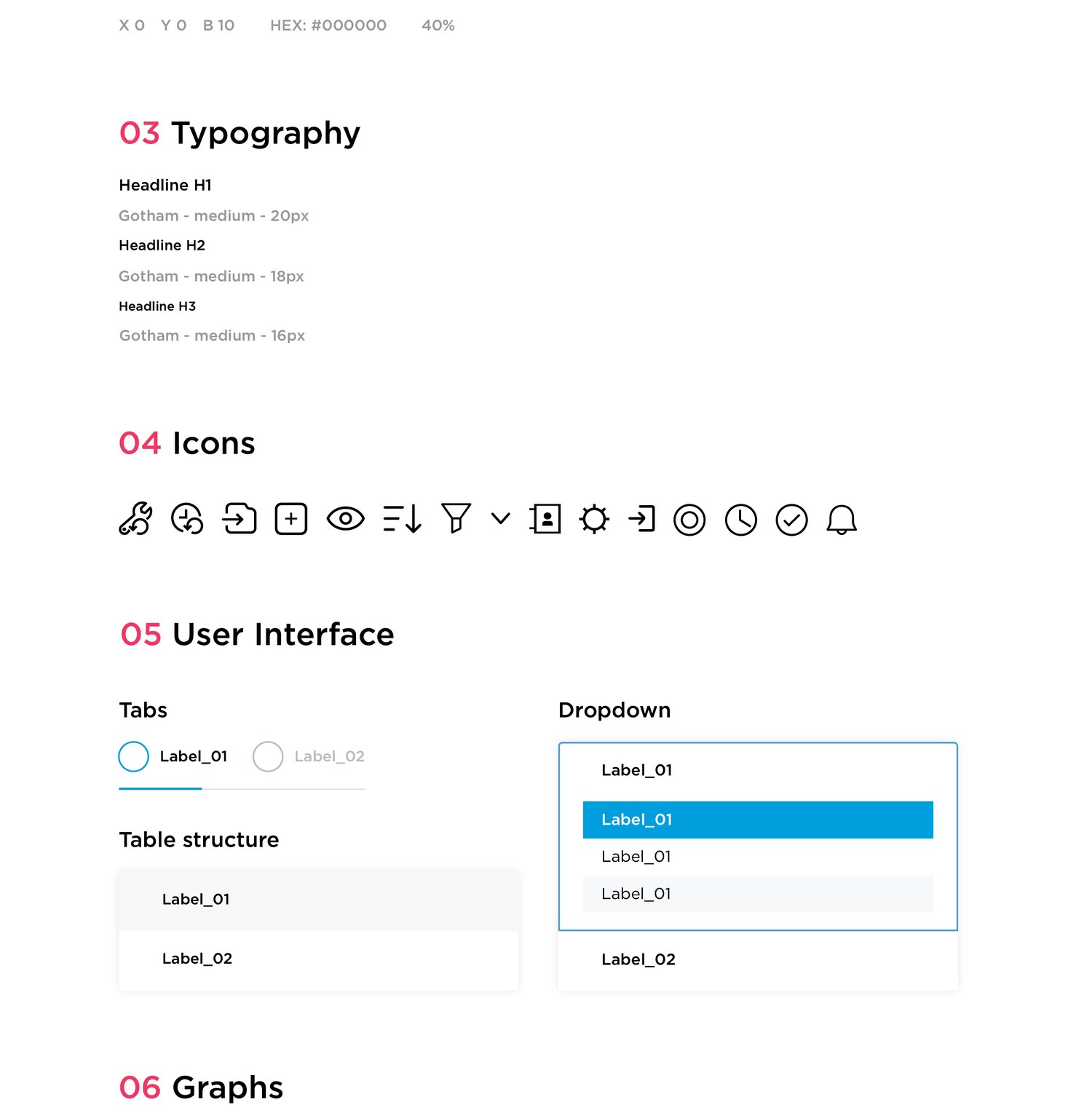
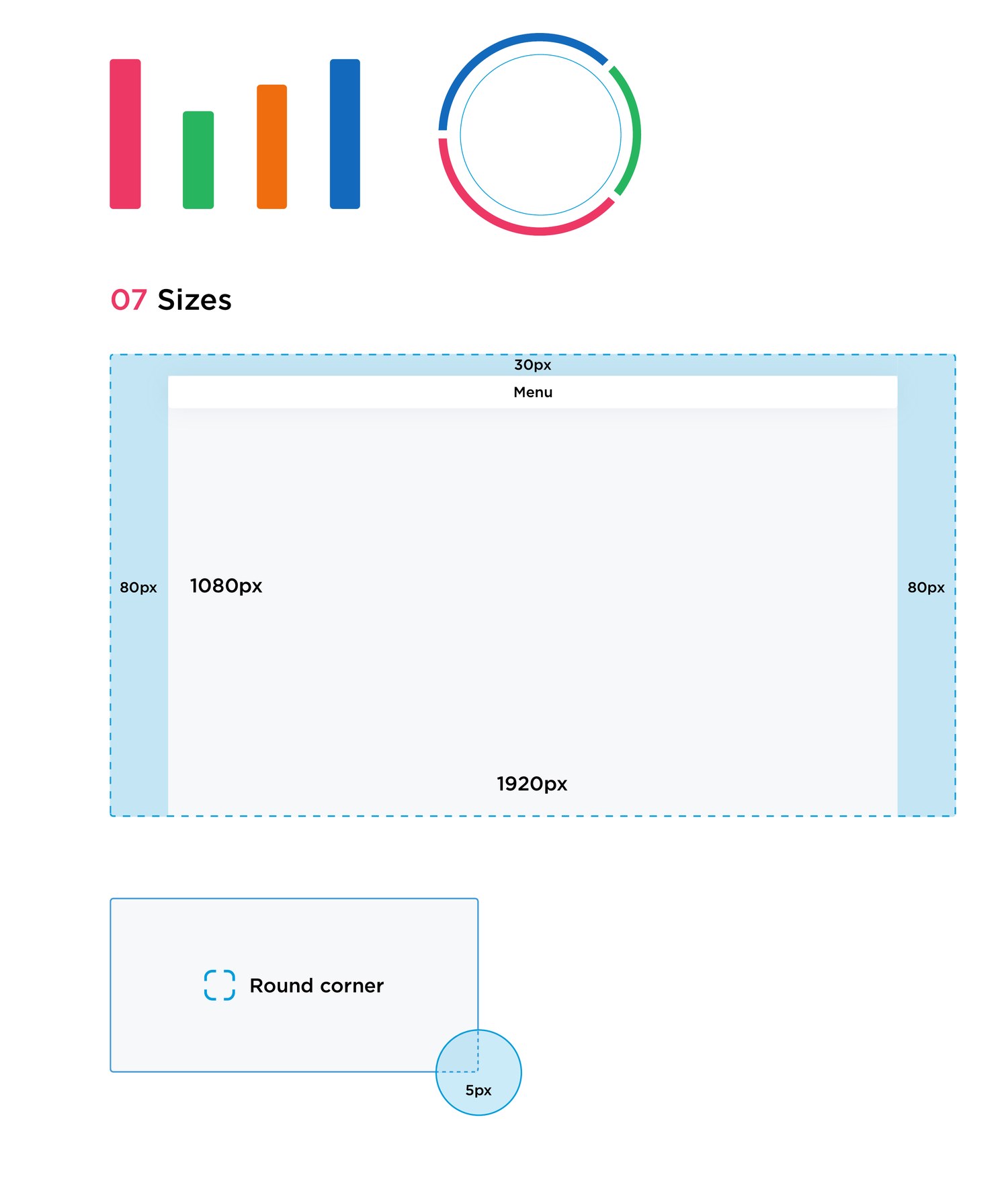
One system, documented
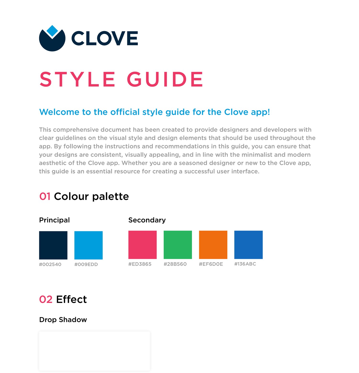
The redesign shipped with a style guide so the visual language held together as the product grew: colour and elevation, typography, the icon set, core components, charts, and layout sizing, all in one reference for designers and engineers.
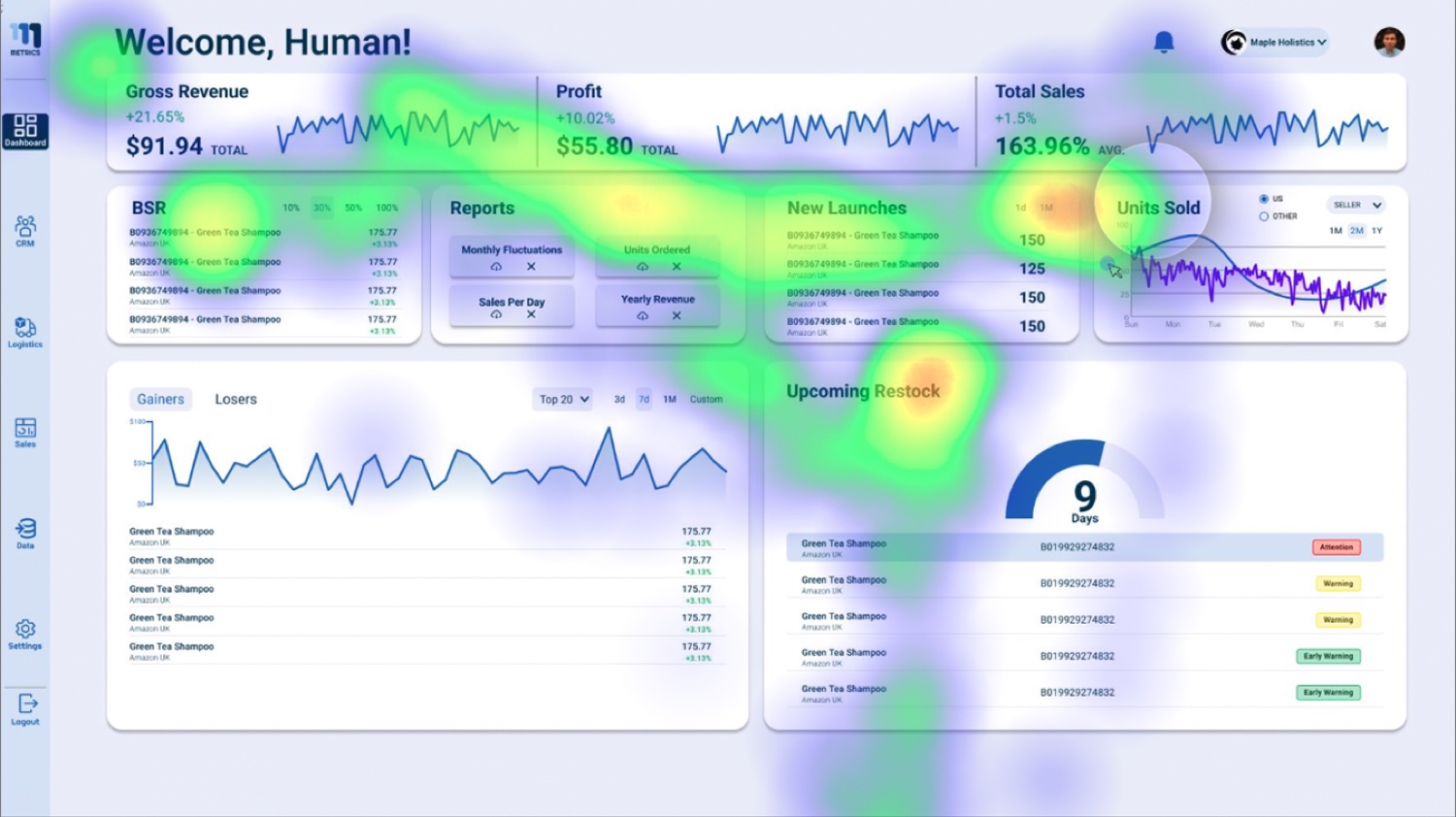
Watching where eyes go
Every stage of the design was tested against behavior, not opinion. Alongside usability tests, eye-tracking heatmaps showed where attention actually landed on the dashboards, and where it never arrived. Navigation structure, button placement, and the color system were each adjusted from that evidence.
The design process began with in-depth exploration of target users’ behaviors, needs, and challenges; nothing was built from assumption. Every decision, from overarching navigation strategy down to minute details, was guided by data from research and usability tests.
From data wrangling to growth
The redesign replaced the endless scroll with a unified, modular dashboard ecosystem: insights are pushed to the seller through intelligent widgets instead of buried in tables. During beta testing we mapped user workflows, refined widget interactions, and streamlined onboarding so the new mental model landed for veteran and new sellers alike.
The result: dramatically reduced cognitive friction, a learning curve that plummeted for new users, and a significant decrease in abandonment. Sellers could finally focus on growth rather than data wrangling.
The final product is a testament to user-centered design, not built on assumptions, but on actual user data and experiences.design stages, Clove